
THE DATA OS · DASHBOARD LIBRARY
Live examples, not static screenshots of 3 year old case studies.
Every dashboard in here is the real report, running in your browser. Filter it, split it, sort it, try to break it. Then notice the thing a screenshot can never do: the tables underneath are a question away.
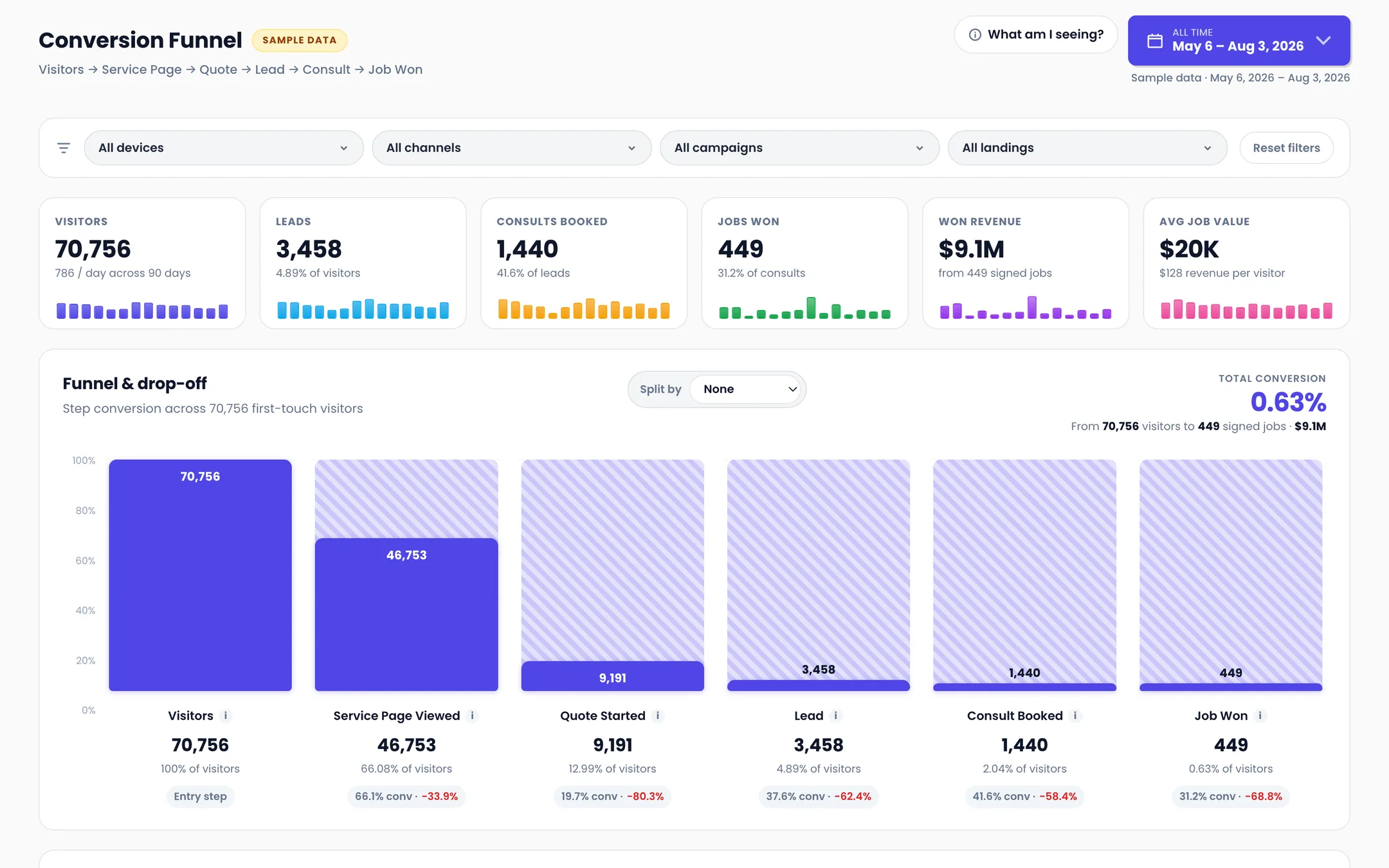 Service business
Service Business Conversion Funnel
Built for: Home services, remodeling, and anyone who sells a quoted job Where do quote requests die between the first visit and the signed contract? Live Interactive MCP-queryable Open the dashboard →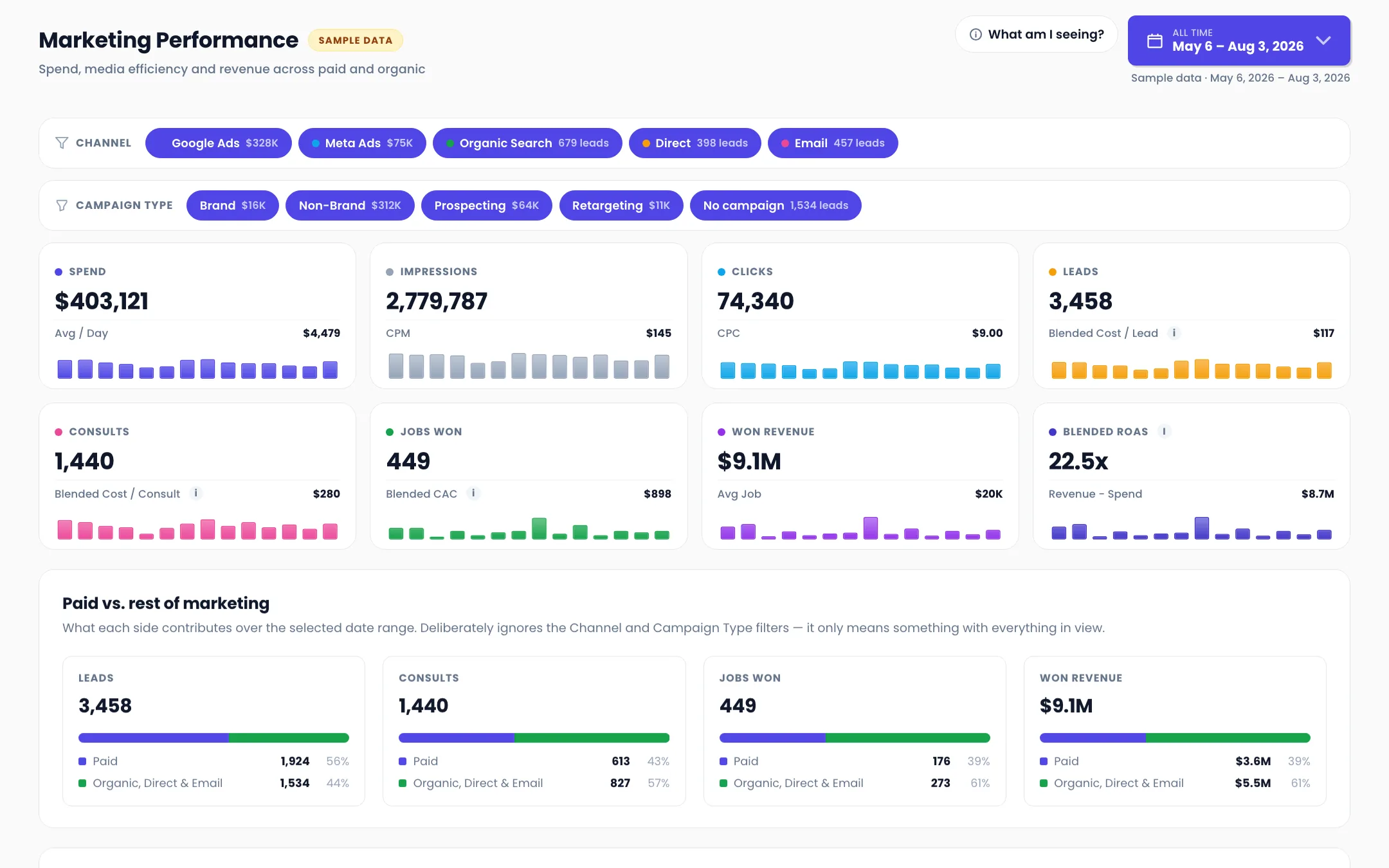 Brand performance
Brand Marketing Performance
Built for: Founders, CMOs, and anyone who has to defend a media budget What did our media spend actually buy, once you follow it all the way to revenue? Live Interactive MCP-queryable Open the dashboard →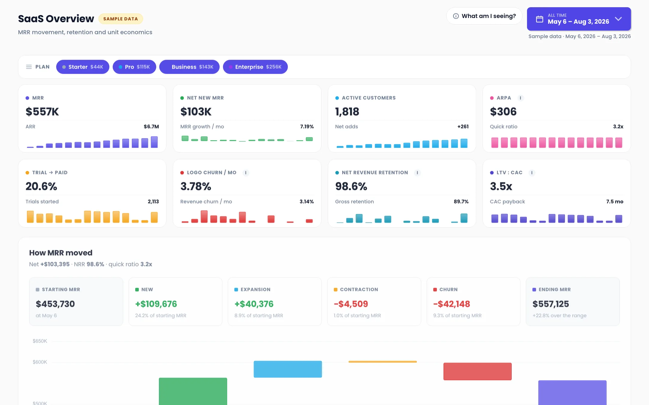 SaaS
SaaS
SaaS MRR, Retention and Unit Economics
Built for: SaaS founders, RevOps, and anyone who has to explain a churn number to a board Is MRR growing because we are winning, or because we are outrunning churn? Live Interactive MCP-queryable Open the dashboard →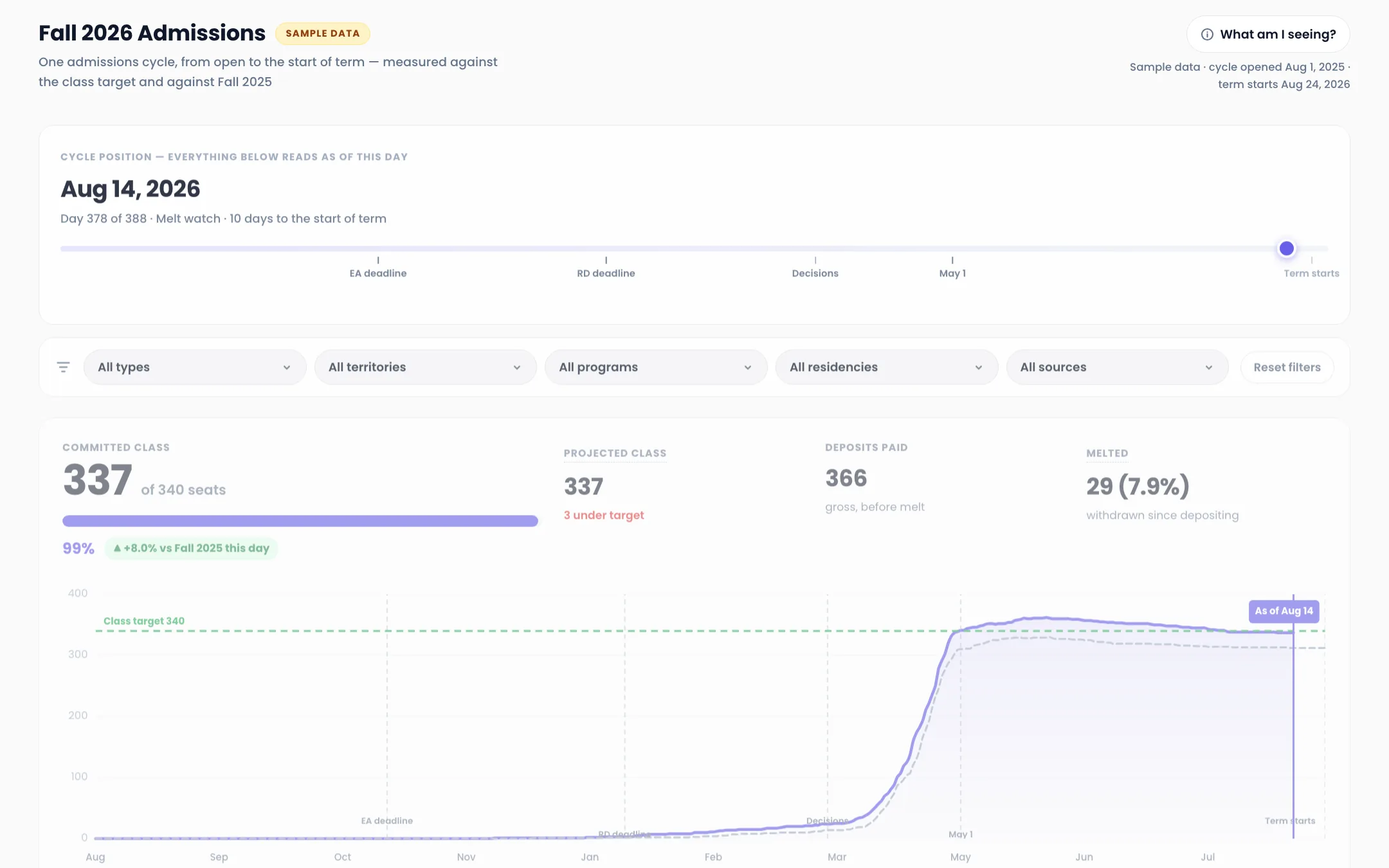 Higher education
Higher Education Admissions Cycle
Built for: Enrolment management, admissions, and anyone accountable for a class target Are we going to make the class, and what is it costing us to get there? Live Interactive MCP-queryable Open the dashboard →Why this library exists
Most dashboard galleries are a slideshow. Somebody screenshots a report, crops the numbers out for privacy, and posts it as a template. You get to look at the shape of someone else's answer.
That is the same failure we watch happen inside companies. A report gets built once, screenshotted, and dies on somebody's desktop. An operator put it to us this way: the AI creates an incredible report, then hands you an HTML file. It has nowhere to live, no way to refresh, no way to share.
So these are live. Every dashboard above runs on a governed pipeline, every number on it has a definition written down, and the tables underneath it are queryable in plain English through your organization's MCP. That last part is the point, and it is the part a screenshot cannot fake.
Organized by business model, because that is how you know whether one applies to you. We would rather ship four dashboards with every number defined than forty screenshots with none.
What every dashboard here has in common
Live, not a picture
The embed on each page is the actual report. Change the date range, split the funnel by device, sort the table by revenue. Nothing here is an image of a number.
Every number has a definition
Each dashboard ships with the written definition of every step it counts. Nobody should have to guess whether a lead means a form fill or a qualified opportunity, and on these pages you never do.
Queryable through your MCP
The dashboard is one view of the tables beneath it. Through your org's MCP, anyone on the team can ask those same tables something nobody anticipated and get an answer that uses your definitions.
Lives in a warehouse you own
In a real deployment the data lands in a BigQuery wired to your billing account. Your existing tools become sources instead of homes, so nothing is held hostage when priorities change.
A screenshot can only answer the question it was cropped for.
Every dashboard you have been sent as an image was somebody else's answer to somebody else's question. The version you can filter, split, and query is the one that answers yours.
Questions about the library
Is this real client data?
No. Every dashboard in the library runs on synthetic rows generated for the demo, so nothing here exposes a client. The structure, the metric definitions, and the pipeline behind them are exactly what we deploy.
Can I get one of these built on my own data?
Yes, that is the actual product. The Data OS syncs your sources into a warehouse you own, defines your metrics once in a glossary, and puts living reports on top. The first live dashboard usually lands inside 2 to 4 weeks.
What does it mean that the data is queryable through the MCP?
Your organization gets one MCP endpoint that Claude, Cursor, or any AI client can connect to. Anyone on the team asks a question in plain English, and the answer is built from the same governed tables the dashboard reads, after consulting your metric definitions. No SQL, and no waiting on an analyst.
Are these dashboard templates I can download?
No, and that is deliberate. A template is a layout. What makes a dashboard trustworthy is the pipeline and the definitions underneath it, and neither of those travels in a file. What you can take from these pages is the thinking: which steps are worth counting, and what to call them.
Keep looking around
The Data OS
The full tour — what it is, what you get, and how engagements work.
Take a look →Why we built it
Most teams don't have a data problem — they have a trust problem.
Take a look →Ask it anything
Four questions, five people who can't answer them, and one system that can. Play the demo.
Take a look →Who runs what
Fully managed by Vision Labs, or run by your team. Drag the blocks and set the split.
Take a look →Security & Trust
Encryption, tenant isolation, least privilege, audit — the posture IT will ask about.
Take a look →For your boss (and IT)
The forwardable one-pager that gets you sign-off, with a copy-paste email.
Take a look →Ready when you are.
Bring the report your team argues about most. Thirty minutes with JJ, no pitch, and we will map what it would take to make it live.