
Higher education · Admissions cycle
Higher Education Admissions Cycle
One admissions cycle from open to the start of term, pinned to a single day so every number reads as of the same moment. Seven stages, six territories against their own seat goals, program demand against seats, and what the committed class is actually worth after discount.
- Live and interactive
- Queryable via MCP
- Sample data
 See it live ↓
THE QUESTION THIS ANSWERS
Are we going to make the class, and what is it costing us to get there?
Why this dashboard exists
An admissions cycle is a year long and it only ends once. That makes almost every general-purpose funnel report useless here: comparing this week to last week tells you nothing when the shape of the year is the whole story, and comparing to last year's total tells you nothing in March. The only honest comparison is the same day of the previous cycle.
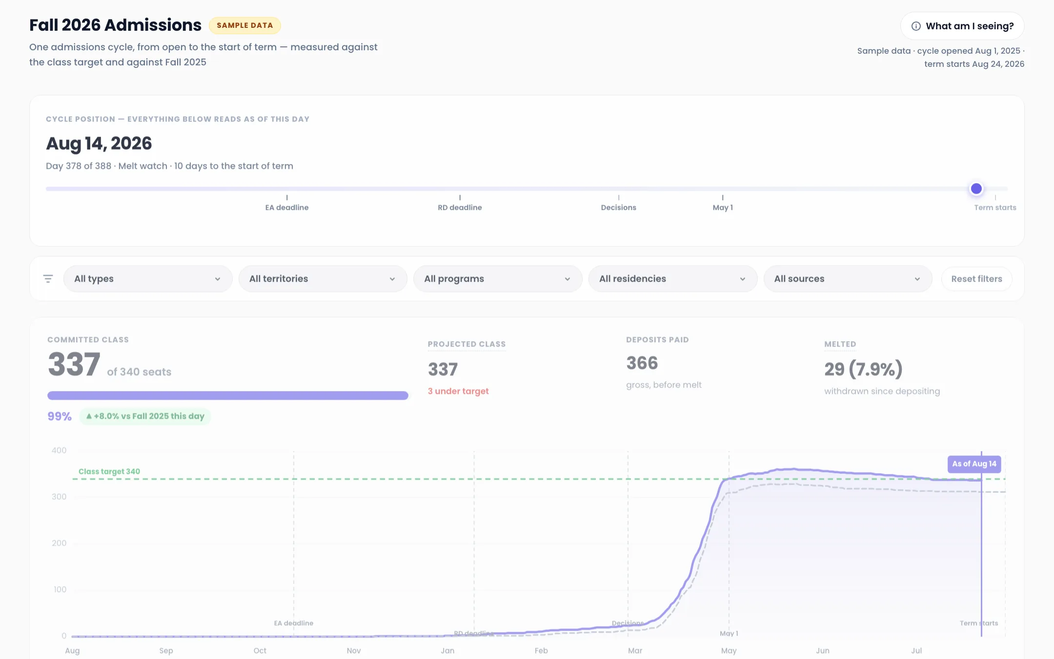
So this dashboard picks a day and holds everything to it. Day 378 of 388 in the version below. Every stage, every rate, and every comparison reads as of that day, against Fall 2025 at day 378 of its own cycle. Drag the day and the entire report moves with it.
It also refuses to stop at deposits. Deposits are not students. Melt takes some of them back over the summer, and the number that matters on the first day of term is net of that. The funnel here runs one stage past where most admissions reports end.
How to read it
Four things the numbers above are saying. Every figure is on the dashboard, so check our work.
The class is made, and it was made with money
337 committed against a 340 target, 99 percent, and 8.0 percent ahead of Fall 2025 on the same day. Then look at the discount rate: 56.3 percent. Gross tuition of $17.7M becomes $7.71M of net tuition revenue after $9.95M of institutional aid. Filling the class is not the same as filling it profitably, and this dashboard puts both numbers on the same screen because they are the same decision.
A campus visit nearly doubles yield
41.4 percent of admits who visited campus deposited, against 21.5 percent of those who never did, across 1,280 offers. That is the largest single separation anywhere in the cycle. The honest caveat is on the dashboard itself: visits are not randomly assigned, so some of that gap is students who were always going to come. It is still the strongest lever the office actually controls after decisions go out.
Discount buys yield, and the curve is steep
Admits offered under 40 percent of the sticker yielded 15.2 percent. Those offered 70 percent or more yielded 39.4 percent. That is the enrolment-management tension in one chart, and it sits next to the academic band, where the strongest admits (3.75+) yield 28.3 percent while the 3.25 to 3.49 band yields 32.3 percent. The students you most want are the ones holding the most competing offers.
The most expensive source is not the one you would cut
Google Ads cost $132,354 and produced 30 net students, $4,412 each. High school visits cost $96,507 and produced 71, $1,359 each. Meanwhile organic search, referral and alumni, and Common App search carry no media cost at all and between them produced 145 students. Blended cost per student is $1,328. Rank by spend and Google Ads looks like the priority; rank by cost per student and it is the line item to defend.
Melt is the number that got worse
29 students, 7.9 percent, withdrawn after depositing, and up 2.2 points against Fall 2025. Every other headline rate improved this cycle. Melt is the one that did not, and it is the cheapest class to recover because those students already chose you once.
What it settles
- Are we ahead or behind last year's cycle on this exact day?
- Which territories are going to miss their seat goal, and how far out?
- What is the class actually worth after discount, not before it?
- Does a campus visit change whether an admit enrols?
- Which recruitment sources produce students rather than inquiries?
- Which programs are oversubscribed and which are running sections at a loss?
- Who is sitting on incomplete files, and how long have they been waiting?
What every number means
The definition of every step this dashboard counts, in the same words the dashboard uses.
- Inquiry
- A prospective student who entered the funnel: an enquiry form, a purchased name list, a high school visit, or a search. The entry step, counted once per person per cycle.
- Application Started
- Inquiries who opened an application and saved at least one field.
- Application Submitted
- Started applications that were submitted before the relevant deadline.
- File Complete
- Submitted applications with every required document received: transcript, recommendations, test scores where required, and essay.
- Admitted
- Complete files that received an offer of admission.
- Deposited
- Admitted students who paid the enrolment deposit. This is gross, before any summer withdrawal.
- Net of Melt
- Deposited students who have not withdrawn. This is the number that turns up in a seat on the first day of term, and it is what the class target is measured against.
Attribution basis. Source credit is first touch: a student belongs to the source that produced their inquiry, and they stay there for the rest of the cycle. That matters more here than in most funnels, because a purchased name list and a high school visit can produce the same inquiry and then behave nothing alike. Cost per student divides cycle-to-date spend by net students from that source, so sources with no media cost show a dash rather than a misleading zero.
In a deployment these definitions do not live in a footnote on a marketing page. They live in your Metric Glossary, and every query has to consult them before it touches the data. That gate is how you govern reporting, and it is why two people asking the same question on a Thursday get the same number.
THE PART A SCREENSHOT CANNOT DO
Every number here is a table. Ask it anything.
The dashboard above is one view of the data underneath it. Somebody chose those steps, that date range, and those four filters. It is a good view, and it will still be the wrong view the first time someone asks a question nobody anticipated.
So the same tables are exposed through your organization's MCP. Claude, Cursor, or any AI client your team already uses connects with a scoped key and asks in plain English. Every question consults your metric definitions first, which is why the answer matches the dashboard instead of arguing with it.
- Are we ahead of last cycle on deposits at this day?
- Which territories will miss their seat goal at the current pace?
- Show net tuition revenue by program, not headcount.
- Which sources produced students under $2,000 each?
- What counts as file complete in this cycle?
- Alert me in Slack if melt passes 8 percent before the start of term.
One endpoint for the whole company. Anyone gets an answer from the warehouse without writing SQL or re-explaining what revenue means. Same Claude. It just stops guessing.
Programmatic access is the most governed path in the system, not the loosest. Per-application keys, single-tenant scope, rate limits, instant revocation, and the acting identity recorded on every request. Read how AI access is governed →
Where the numbers come from
In a deployment, the rows behind a dashboard like this arrive from every platform the business runs on. Ads, analytics, the CRM, and the contract values that close the loop. They get synced, modeled on the way in, and stored in a warehouse wired to your billing account.
- Slate or your CRM
- Common App
- College Board and Niche name buys
- Google Ads
- Meta Ads
- Organic search
- High school visit records
- Student information system
Your tools stay exactly where they are and become sources instead of homes. Swap an ad platform next quarter and the reporting holds. See the full pipeline → or decide who runs which piece →
Questions about this dashboard
Is this real institutional data?
No. The rows are synthetic, generated for this demo, so nothing here exposes an institution. The stages, the written definitions, and the pipeline that would feed them are the real thing.
Why does everything read as of one day rather than the whole cycle?
Because a cycle only ends once, and a mid-cycle total compared against last year's final total is meaningless. Pinning to a day lets you compare Fall 2026 at day 378 against Fall 2025 at day 378. Drag the day and every number on the page moves with it.
Why is the funnel measured past deposits?
Deposits are not students. 366 deposited here and 29 melted before the start of term, so the class is 337. Any report that stops at deposits is quoting a number that has not happened yet.
Why is the admit rate so high?
59.1 percent of complete files, which is normal for an institution that is not selective by design. Selectivity is a positioning choice, not a quality measure, and the number that matters here is whether the class gets made at a discount rate the institution can afford.
Can I see this on my own cycle?
That is the product. Slate or your CRM, the Common App feed, your name-buy files and your media spend sync into a warehouse you own, every stage gets defined once in a glossary, and reports like this sit on top. The first live dashboard usually lands inside 2 to 4 weeks.
How would my team query this instead of reading it?
Through your institution's MCP. Claude, Cursor, or any AI client connects with a scoped, revocable key, and every question consults your stage definitions before it touches the data. A counselor can ask which of their students are missing a transcript and get the same answer the dashboard would give.
Keep looking around
The Data OS
The full tour — what it is, what you get, and how engagements work.
Take a look →Why we built it
Most teams don't have a data problem — they have a trust problem.
Take a look →Ask it anything
Four questions, five people who can't answer them, and one system that can. Play the demo.
Take a look →Who runs what
Fully managed by Vision Labs, or run by your team. Drag the blocks and set the split.
Take a look →Security & Trust
Encryption, tenant isolation, least privilege, audit — the posture IT will ask about.
Take a look →For your boss (and IT)
The forwardable one-pager that gets you sign-off, with a copy-paste email.
Take a look →Ready when you are.
Want this shape on your own numbers? Thirty minutes with JJ. Bring the funnel you cannot currently see end to end, and we will map what it takes.