
SaaS · Revenue and retention
SaaS MRR, Retention and Unit Economics
Where MRR came from and where it went, as a waterfall rather than a single growth number. Cohort retention for the whole book, plan mix showing where customers sit versus where revenue sits, and the unit economics underneath: ARPA, NRR, LTV to CAC, and payback.
- Live and interactive
- Queryable via MCP
- Sample data
 See it live ↓
THE QUESTION THIS ANSWERS
Is MRR growing because we are winning, or because we are outrunning churn?
Why this dashboard exists
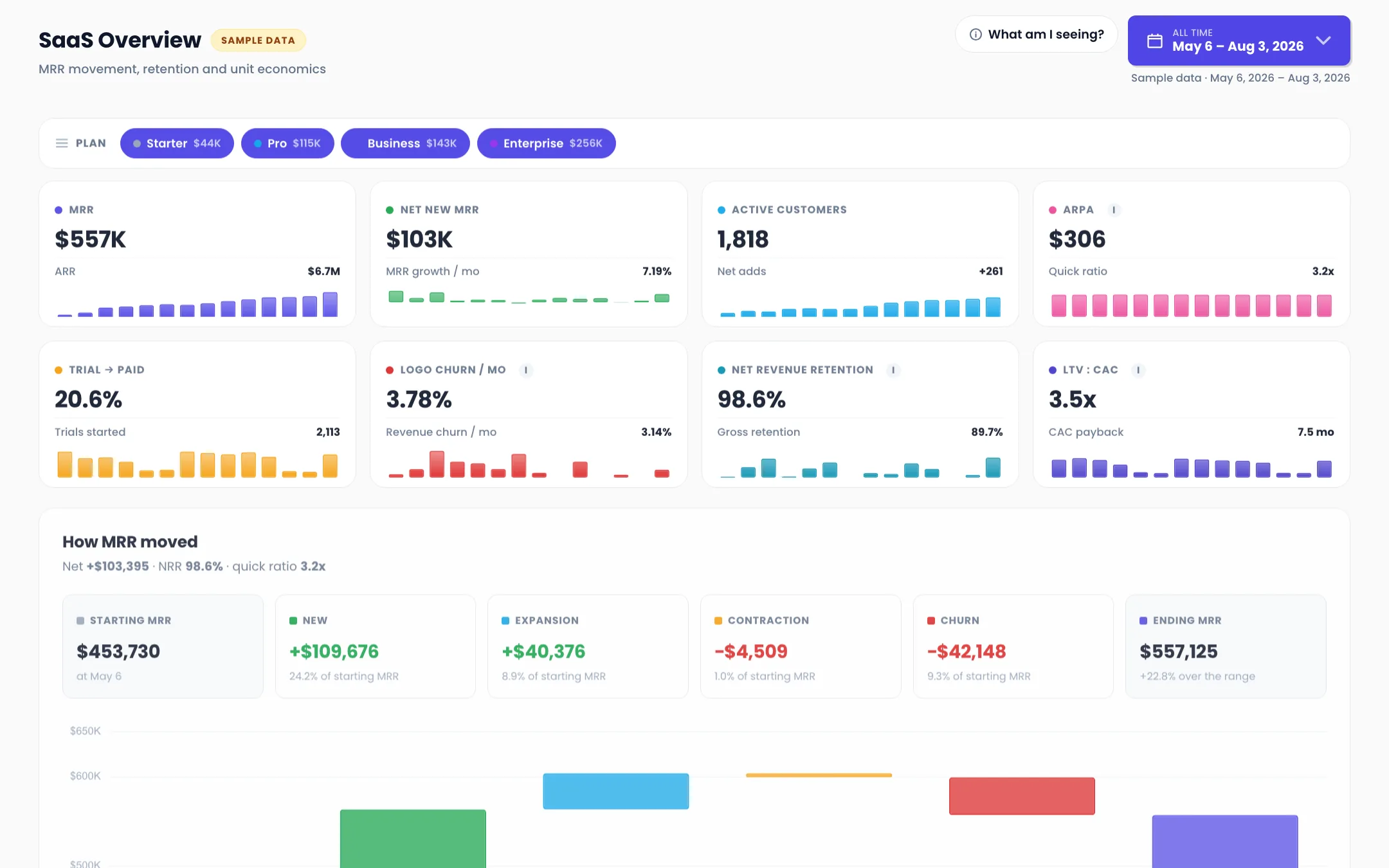
Net new MRR is one number covering four opposing forces. $103,395 of growth can be a great month or a bad one depending on whether it came from new logos, expansion in the existing book, or simply less churn than last month. A single growth figure cannot tell you which, and the decision you take is different in each case.
So the centre of this dashboard is a waterfall, not a line. Starting MRR, then new, expansion, contraction and churn applied in turn, ending at closing MRR. Every one of those movements is a different team's problem.
The second thing it refuses to average is retention. Logo retention and revenue retention answer different questions, and a company can hold NRR near 100 percent while losing accounts steadily, which is exactly what is happening in the version below. Both are here, side by side, because quoting either one alone is how a board gets surprised.
How to read it
Four things the numbers above are saying. Every figure is on the dashboard, so check our work.
MRR is holding while the account base leaks
Net revenue retention is 98.6 percent, near enough to flat. Logo churn is 3.78 percent a month. Both are true at once because the accounts that stay are growing enough to cover the ones that leave. That is a real business, but it is a different business from one growing at 98.6 percent NRR with 1 percent logo churn, and only the cohort grid tells them apart.
Starter is 46 percent of customers and 7.8 percent of revenue
834 Starter accounts at $52 ARPA produce $43,657. 84 Enterprise accounts at $3,044 produce $255,659. Enterprise is 4.6 percent of the logos and 45.9 percent of the money. Starter also churns hardest, at 5.28 percent a month against Enterprise's 2.02, and its NRR is 85.6 percent against Enterprise at 100.1. Nearly half the support load sits on the tier that funds almost none of it.
One enterprise cancellation is visible from orbit
The week of Jun 8 lost $16,432 of MRR and posted the only negative net-new week in the range, minus $4,559. Revenue churn spiked past 14 percent while logo churn barely moved, which is the signature of a single large account leaving rather than a broad problem. Averaging that week into a monthly churn rate would hide the entire event.
Retention improves cohort over cohort, which is the number that matters
The Aug 2025 cohort held 59 percent of accounts at month 12. Nov 2025 held 85 percent at month 8, against Aug 2025's 65 percent at the same age. Each newer cohort sits above the one before it at equal maturity. That is product and onboarding working, and it is invisible in any aggregate churn number, which mixes cohorts of every age together.
3.5x LTV to CAC with 7.5 months of payback is fine, not exciting
The ratio clears the usual 3x bar. Payback at 7.5 months means capital is tied up for two quarters per customer. Both numbers are hostage to the churn figure in the denominator, so a small move in Starter churn moves LTV to CAC more than any pricing change would. That is worth knowing before anyone reprices.
What it settles
- Did MRR grow because of new logos, expansion, or less churn?
- Are newer cohorts retaining better than older ones?
- Which plan tier is actually funding the business?
- Was that a churn trend or one large account leaving?
- How long is our capital tied up per customer?
- What does NRR include here, and does it match what the board thinks it means?
What every number means
The definition of every step this dashboard counts, in the same words the dashboard uses.
- MRR
- Monthly recurring revenue from active subscriptions at the end of the selected range. Excludes one-off fees, services, and usage overage.
- New MRR
- MRR from customers who had no active subscription at the start of the period.
- Expansion MRR
- Increase in MRR from existing customers: upgrades, seat additions, and tier moves.
- Contraction MRR
- Decrease in MRR from existing customers who stayed: downgrades and seat removals.
- Churn MRR
- MRR lost from customers who cancelled entirely in the period.
- Net Revenue Retention
- Starting MRR plus expansion minus contraction minus churn, divided by starting MRR, for a fixed cohort of existing customers. New MRR is excluded, which is what separates it from growth.
- Logo Churn
- Accounts that cancelled in the period as a share of accounts active at the start. Counts customers, not dollars.
- LTV : CAC
- Average revenue per account divided by revenue churn, over blended acquisition cost. A ratio, not a promise, and it moves with whichever of those three inputs changes.
Attribution basis. Every movement is assigned to the period in which it took effect, not the period it was booked or invoiced. A customer who downgrades on the last day of a period lands in that period's contraction, not the next one's. Cohort retention is by signup month and covers the whole book back to Aug 2025 regardless of the date filter above it, because a cohort chart filtered to the last 90 days would only ever show 100 percent.
In a deployment these definitions do not live in a footnote on a marketing page. They live in your Metric Glossary, and every query has to consult them before it touches the data. That gate is how you govern reporting, and it is why two people asking the same question on a Thursday get the same number.
THE PART A SCREENSHOT CANNOT DO
Every number here is a table. Ask it anything.
The dashboard above is one view of the data underneath it. Somebody chose those steps, that date range, and those four filters. It is a good view, and it will still be the wrong view the first time someone asks a question nobody anticipated.
So the same tables are exposed through your organization's MCP. Claude, Cursor, or any AI client your team already uses connects with a scoped key and asks in plain English. Every question consults your metric definitions first, which is why the answer matches the dashboard instead of arguing with it.
- Break net new MRR into new, expansion and churn for last month.
- Which cohort retains best at month 6?
- What happened in the week of June 8?
- Show NRR by plan, not blended.
- Does our NRR include new customers?
- Alert me in Slack if logo churn goes above 4 percent in any week.
One endpoint for the whole company. Anyone gets an answer from the warehouse without writing SQL or re-explaining what revenue means. Same Claude. It just stops guessing.
Programmatic access is the most governed path in the system, not the loosest. Per-application keys, single-tenant scope, rate limits, instant revocation, and the acting identity recorded on every request. Read how AI access is governed →
Where the numbers come from
In a deployment, the rows behind a dashboard like this arrive from every platform the business runs on. Ads, analytics, the CRM, and the contract values that close the loop. They get synced, modeled on the way in, and stored in a warehouse wired to your billing account.
- Stripe or your billing system
- Your product database
- Your CRM
- Google Ads
- Meta Ads
- Product analytics
Your tools stay exactly where they are and become sources instead of homes. Swap an ad platform next quarter and the reporting holds. See the full pipeline → or decide who runs which piece →
Questions about this dashboard
Is this real company data?
No. The rows are synthetic, generated for this demo. The metric definitions, the waterfall logic, and the pipeline that would feed them are the real thing.
Why is NRR 98.6 percent when MRR grew 22.8 percent?
Because they measure different things. NRR excludes new customers on purpose: it asks whether the existing book is growing on its own. MRR growth includes new logos. A company can grow fast on acquisition while its existing base shrinks, and separating the two is the entire reason NRR exists.
Why does the cohort grid ignore the date filter?
Because a retention cohort filtered to the last 90 days would show every cohort at or near 100 percent and tell you nothing. Cohorts are only meaningful across their full life, so that section covers the whole book back to the first signup month regardless of what is selected above it.
Why does the waterfall axis not start at zero?
Because contraction is around 1 percent of the base and on a zero-based axis it renders as a hairline you cannot see. The floor sits just under the lowest level and the two anchor bars are drawn from that floor, which is stated on the chart itself rather than left for someone to discover.
Can I see this on my own billing data?
That is the product. Stripe or your billing system, your product database and your ad accounts sync into a warehouse you own, every metric gets defined once in a glossary, and reports like this sit on top. The first live dashboard usually lands inside 2 to 4 weeks.
How would my team query this instead of reading it?
Through your organization's MCP. Claude, Cursor, or any AI client connects with a scoped, revocable key, and every question consults your metric definitions before it touches the data. When someone asks for churn, the definition decides whether they get logos or dollars, rather than whoever built the query.
Keep looking around
The Data OS
The full tour — what it is, what you get, and how engagements work.
Take a look →Why we built it
Most teams don't have a data problem — they have a trust problem.
Take a look →Ask it anything
Four questions, five people who can't answer them, and one system that can. Play the demo.
Take a look →Who runs what
Fully managed by Vision Labs, or run by your team. Drag the blocks and set the split.
Take a look →Security & Trust
Encryption, tenant isolation, least privilege, audit — the posture IT will ask about.
Take a look →For your boss (and IT)
The forwardable one-pager that gets you sign-off, with a copy-paste email.
Take a look →Ready when you are.
Want this shape on your own numbers? Thirty minutes with JJ. Bring the funnel you cannot currently see end to end, and we will map what it takes.