Google Looker Studio came out in 2016, but in 2022, Google renamed and rebranded it as Google Looker Studio. (Want to learn more about LookerStudio’s Most recent updates? Read here!)
While Google Looker Studio allows users to create an interactive dashboard, Looker Studio offers more than that.
Want to find out if Looker Studio is the right visualization tool for you? Click here to get the low down on the best visualization tool for your needs
Google explicitly designed Looker Studio for enterprises to give them a single centralized point of truth. It allows you to use this data to create advanced models, machine learning models, and charts that let you keep track of website trends and metrics as they change over time. But which of these charts should you use?
The three chart types you’ll see most often are scorecards, tables, and line/bar charts. Each kind of chart has its benefits. Before we examine their pros and cons and break down which chart you should use, let’s go through what they look like and how they function.
Want to see these charts in action? Check out our very own LookerStudio Report here, which takes you through the pros and cons of the charts you are about to learn all about!
Score Cards

Scorecards are as basic as you can get when it comes to charts. It is simply an aggregation of whatever metric you want to visualize.
Want to know the total amount of visitors your website has gotten or the total number of sessions? Use a scorecard. Simple, easy, done!
Tables ????️

Tables are the foundation of any chart. While they may not look too fancy, they are certainly invaluable. They lay out the relationship between dimensions and metrics, and all other charts are essentially gussied-up tables.
Traditionally (in Looker Studio), tables are laid out with the dimension(s) in a column on the left and the metric(s) in a column on the right. They are read across in rows with dimensions and metrics in the same row corresponding with one another.
We love tables. Any time you are in doubt when it comes to building some of the more complicated visualizations in Looker Studio, start with a table. The simple and readable layout can really help when it comes to clearly understanding the data you are trying to visualize.
Line Charts and Bar/Column Charts ????️


You can use line and bar charts for similar purposes because they function similarly. They both have an X-axis (horizontal) that depicts one measurement and a Y-axis (vertical) that depicts another. For line charts, one of these measurements is usually time, with the chart representing x number of occurrences over y period.
In most cases, the main difference between a line chart and a bar chart is how they depict the information. A line chart plots a point based on related data, and the points connect with a line (where the chart gets its name). A bar chart instead depicts each data point as its own bar. These bars can be oriented vertically or horizontally based on the creator’s preference.
Line and bar charts are incredibly useful when it comes to data analytics. We use these types of charts constantly to visualize trends in revenue, views, sessions, and much more!
Pie Charts ????

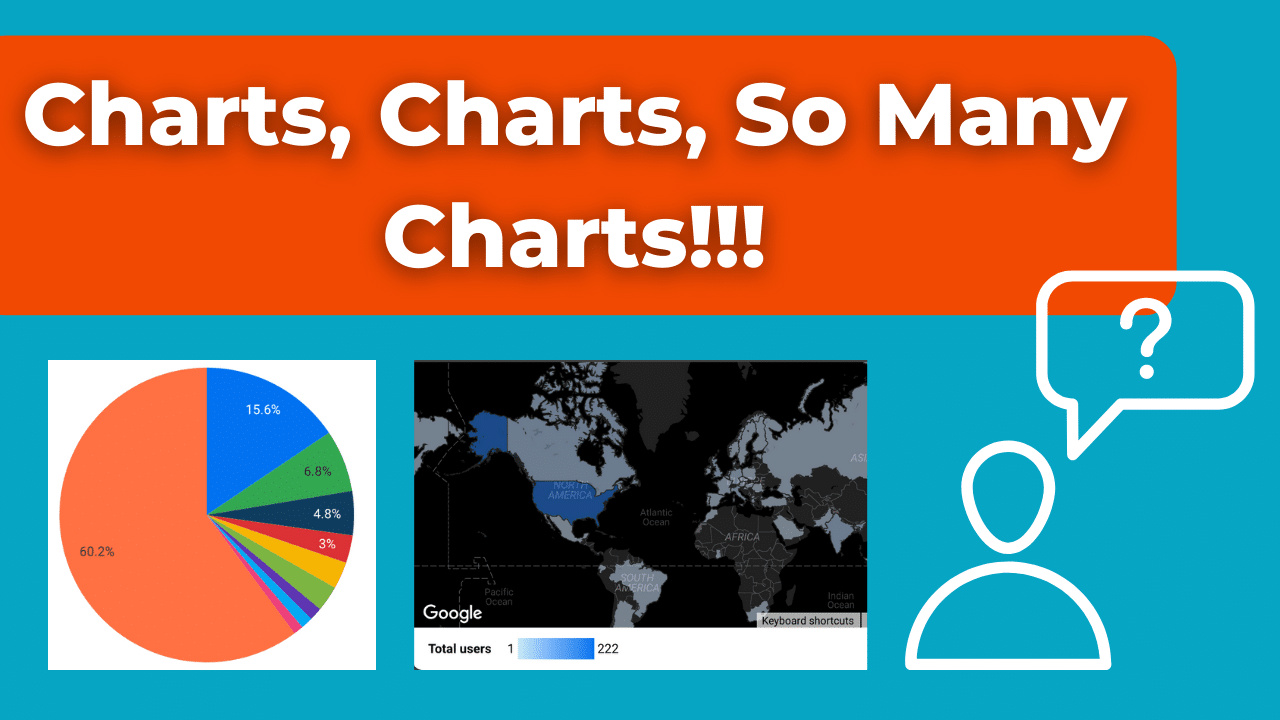
Unlike the other two chart types, pie charts have no axes and function differently. Most often, it represents a percentage of something. The total of whatever you’re measuring will be depicted as a circle. That circle has segments based on the specific statistics you want to measure.
???? The most common use of a pie chart is to depict demographics. The overall circle would represent an audience. The pie chart may then be segmented based on gender, ethnicity, age, or other variables.
⬇️ The biggest downside of a pie chart is that it can only really depict one variable at a time. For example, you can’t depict gender and age on the same graph because it would mean someone could only be a specific gender or age, not both.
Because of this, you won’t see us using pie charts very often, if ever. While they may not be our favorite, it can be helpful to know they are there if you need them!
Map Charts ????️

Map charts are one of the more self-explanatory visualization styles. These charts are incredible at doing primarily one thing, and that is tying certain metrics to a location.
Map charts often use a sort of density visualization, whether that be a bubble or a color scale that allows you to see the concentration of a metric across a map.
If you wanted to show the amount of viewers per country, this would be a great chart to utilize.
With all the GA4 updates, we know it can get confusing. Head here to learn how to use Looker Studio without hitting GA4 API Limits.
???? When to use a Line Chart vs. a Bar Graph ????
There are several similarities between line charts and bar charts. Still, that doesn’t necessarily mean that they’re interchangeable. Line charts are optimal for showing changes in data over time. While bar charts can be used for this purpose, and often are, it’s not as easy to grasp with a quick glance.
????Bar charts allow you to estimate your data points almost instantaneously, making them optimal when working under a time crunch.Bar charts are often better for showing significant differences in sizes and numbers of items and or occurrences in general rather than within a given period. Bar charts are often used to depict things like click-through rates, average website shares per view, and similar metrics.
???? Line charts are often more suitable for comparing multiple data points at once within the same time frame and are better at showing smaller, more detailed changes. You can use them to compare things like your impression share vs. that of your competitors. They are also handy for tracking trends and growth.
???? Template Examples ????
A template is a type of report you can access in Looker Studio. You can interact with these templates by opening them in view mode like any other report and clicking edit or share. You can save these templates and share them as your own reports. You can modify them later as needed, too.
Check out some of our favorite Looker Studio templates here!
There’s also a gallery in Looker Studio where you can submit templates to share and use as examples for other Looker Studio users. Here, you can also view examples that other users have shared.
If you want to take your visualizations to the next level, check out our posts on custom visualizations, blending, and custom navigation bars.
???? Metrics You Want to Track ????
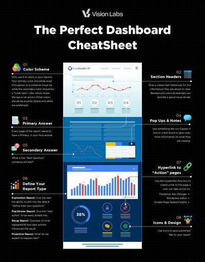
When using Looker Studio, the charts you use won’t matter if you track the wrong metrics. Looker Studio is entirely customizable, meaning you can include or exclude as many metrics as you want. However, that doesn’t mean you should create a data dump by adding every metric.
You should only include metrics you (or your client) care about. Things like spending and revenue are always great for measuring things like ROI. Other things are also beneficial to include, like brand awareness. Stats like pre-click metrics, impressions, and view rate may also be more helpful than you think.
Ultimately, the metrics you should include depend on you and your business. What are the business’ needs? What are your goals? What do you intend to gain from the metrics you use? When determining which metrics are right for you, these are all questions you should ask yourself.
???? Don’t Track All Metrics ⛔
Not everyone will need to track the same metrics. You’ll need to leave some things out to avoid data dumping or overload. If there are metrics that aren’t giving you vital insight or helping you find ways to improve your strategy, then you probably don’t need them. Your discretion is critical when maximizing the usefulness of the metrics you choose to chart and track, so use your attention wisely!


