JJ Reynolds of Vision Labs and Ethan Aaron of Portable give you the tell-all on effective dashboard building.
About Ethan Aaron & Portable
Ethan started his data journey at a small startup building dashboards taking data from a read replica of a database and building charts to run the business.
When they got acquired by Live Ramp Ethan asked himself why they didn’t have a data team so he wrote his job description to become the head of business intelligence or head of analytics at Live Ramp.
He then worked in corp Dev and M&A in the data world before starting Portable four years ago.
When you look around at all the data integration tools, the people who pull data from applications and systems and put it in data warehouses all have the same 200 Integrations.
The problem is if you want data from other tools or if you want one tool that has all the Integrations it doesn’t exist so Portable set out to focus on how you build 10,000 Integrations. Currently, they’re at about 1,300 with a path to get to 10,000.
Portable is an ELT tool, that extracts data from business applications and puts it in data warehouses either for systems that you can’t find a connector to anywhere else on the market or for more common systems like Clavo, Pendo HubSpot Etc.
For those, it’s typically a support reliability or cost consideration that drives someone to Portable over other Solutions.
About JJ & Vision Labs
I’m JJ Reynolds founder of Vision Labs we’re a marketing data agency. We work with teams to integrate data from various sources and build up reporting that makes sense. We’re known for building dashboards that make sense to everybody involved.
People come to us and refer us when they need to make their reports super actionable for their teams.
Minimum Viable Dashboard
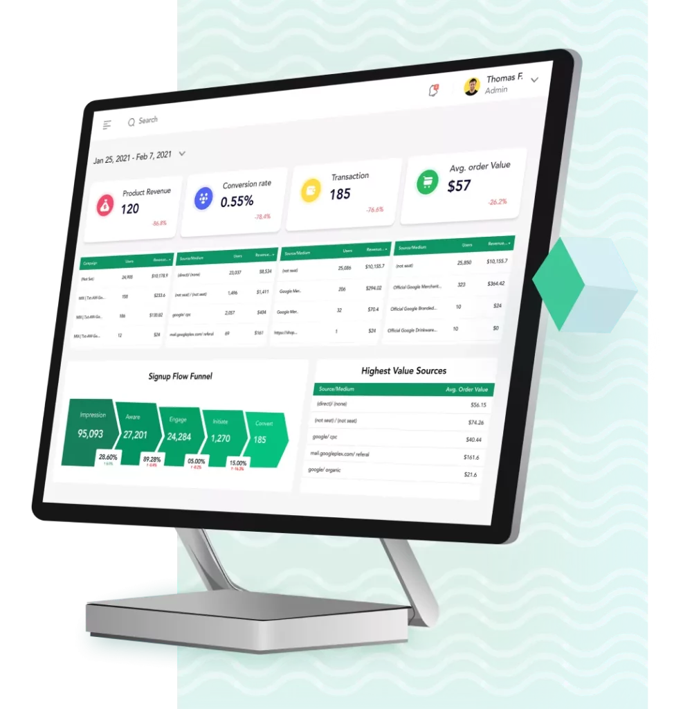
95% of the reports that we see out there have too many numbers on them and no one knows what to do with the numbers. The goal is Simplicity, if you can simplify your dashboard it becomes much easier to act.
“I would have made it simpler but I didn’t have enough time”
I would have made it simpler but I did not have enough time is something that keeps happening so basically what we want to do is remove everything except for the action as much as possible.
At Vision Labs, we serve as a measurement Department as we manage all these our clients. We work in the Google stack mostly Big Query and Looker Studio on the marketing acquisition side of things. If you have questions click here.
Why does your dashboard end up like this?
Where you have a lot of data a lot of numbers and no one knows what to do with it.
It comes down to the data person being unable to put themselves into the shoes of a marketing person, an HR leader, a sales leader or a CEO and think about what they care about. You have to figure out how to put yourself in their shoes and think about what they care about every day.
You can’t think about the narrative through your perspective as a data person you have to think about the narrative through the lens of the business person who is going to do something something with the the information.
That is the most important thing of all of this is don’t think about it as a data deliverable think about what are you going to do with the data what are the things that you’re doing next and make it super clear what those are. That’s the challenge.
In general, there’s no action and no one knows what to do with that data. Often people are just checking boxes, we have this report because we have to have this report.
At the core of it, there’s too much data, there’s too many numbers and too many things that don’t matter.
The Big Problem
The big problem is the complexity to time ratio. At the core of it is that over time creating dashboards and getting data has become easier, and at the same time the volume of data is increasing, we’ve got more ad platforms we’ve got more internal servers.

Over time what happens is that the readability of your dashboard just goes off the chart in terms of complexity. The goal here is to take this red line and make our readability easier and that will in turn make it easier to take action.
The easiest way to combat this is going to be following this little framework that we use.
MVD Framework
If you apply this Minimal Viable Dashboard Framework every time someone asks a question of you it will make your life way easier.
1 – What Is Important?
START with 1 Metric. Choose one metric that you think is important, don’t use Revenue because revenue is always important. It could be uptime, it could be new leads, it could be the number of page views.
How do you talk to business stakeholders about a metric? How do you get to a metric when you’re talking to business stakeholders?
We have something we call the Foresight System
It’s a dumbbell approach where on one side is the bottom metric, like revenue or profit if you want to get spicy, and on the other side you have Impressions and we do start at a metric and then see what things influence it and at what granularity do we need to know that.
We work to dissect what their thought process is when they see a number and then we try to put that onto a report so that they can see the influence levers and how they affect that bottom number.
Before you even get started thinking of a specific metric as the problem you need a high-level view of your entire funnel. For me to know what matters I first need to know the whole process. So that we can focus on the easiest problem to solve that will have the highest impact.
Once you have your metric selected then you look at what allows you to optimize or improve that number, and what time frame you need to be looking at.

2 – Get the Data Fast (then iterate)
Now that you have the metric that is important to your business defined it’s time to get the data fast so that you can test out your hypothesis.
How to Get Your Data:
- Super Easy – Export manually
- Medium – Visual Connector (Database to Visuals)
- Hard – Database (BigQuery)
- Super Hard – Real Time
To get started go with the easiest way so that you can cut down on the time that you need to iterate on the boring part of writing SQL or creating the joins. Get your export and just go for it!
Keep in mind that there are scenarios where you might need Big Query and there are scenarios where you need real-time data pipelines, you need to know what level of granularity you need and decide whether you need real-time data or not and if your needs justify the investment.
3 – Ask Your “By” Questions
The next point here is to define your “By” questions, what do you need this data broken down by? You have your metric but do you need it broken down by:
- Date (hour, day, week, month, quarter, year)
- Day of the week
- Entry Point (what they opted in to)
- The page they opted in
- Source
- Cost per type
These “by” questions are helpful especially if you’re interviewing someone or talking to a stakeholder, they allow you to create a relationship between a data person and a stakeholder or marketing director.
How do you summarize these “by” questions and know what will move the needle and how to break them down?
If you’ve been in data long enough you can start to have a sense of what to look at and make some hypotheses and then validate or disprove them pretty quickly.
But it can be a lot easier, this is a phenomenal place to use Chat GPT or Gemini or any of these types of tools and ask them to give you 10 things that you might use as a way of identifying the “By” questions.
The other tool I use is Google Image Search, you would be amazed at how easy it is to find dashboards that someone else has built where they have a scaffold for how to think about the levers that then influence your metric.
Someone has already thought about your problem, you don’t need to recreate the entire thing but if you go see how they thought about the problem you can then come back to these “By” questions and select how you want to break down your data.
And to level that up a great mental hack is to think: “Is this a bad number or a good number?” if you can get into that mindset you become like a weapon of the data world.
Most people look at a number and move on with their life, if you can take it one step further and think if the checkout conversion is 2% probably what should happen is we adjust our messaging because 2% seems low, if you can get into that mindset you’re spicy and dangerous!
Go one step further, when you’re a data person your job isn’t just to collect the information in a dashboard for someone else to solve, it’s your job to solve the problem!
A great hack is to book demos or calls with companies that specialize in solving this problem and learn from them how they would solve this issue and take advantage of their expertise.
You shouldn’t feel bad about doing this because there is a very real world where that solution then becomes a way for you and your company to improve that conversion metric and solve your problem.
That’s where these buy questions of granularity come into play, do you need to know Revenue by day? do you need to know it by week? do you need to know it by week versus the previous week?
This is where things start to get complex and you can overwhelm people quickly.
That’s where dashboard screenshots help, you can take one metric, and now you have six different data points, we’ve taken one number and extrapolated it out into like 20 different numbers on a page.
You want to be wary of when you start building out reporting like what you are doing this for.

Here’s another example we have new contacts by lead, or you might have it by source (where they came from) versus the previous period.

This way you can ask your “by” and tie it back to an action, where we are trying to do something.
4 – Granularity Required
Your granularity will depend on our frequency of failure.
To the next point of the granularity this is where a lot of people get stuck, especially at bigger companies, do you need it by time of year? half-year? quarter? monthly? etc. What do you need these for right?
There are scenarios where a data flow can take over 24 hours to get data out of the system and there are other scenarios where people want data in real-time but don’t use the data in real-time. It’s not a Speed game!
One of the key metrics at Portable that is important to have in real-time is failures, we need to know how many flows are actively failing at any given point in time and how long have they been failing.
This is the perfect scenario where you need live data and you need it by client or user so that you have that granularity to know who they were.
But for a lot of other metrics like revenue, we don’t need to have data updated every 15 minutes because then you’re looking at a number that varies widely in a given day.
It becomes a liability to do that, you don’t need to know your revenue every 15 minutes as it becomes a waste of mental energy.
You can take that same number right of failures and look at it as a percentage of flows that have failed by month to decrease this over time.
You could have all these as a way to break down that data and for a lot of people this is intuitive especially if you’re in the business world, but often there’s a disconnect when a data person talks to a business ops person especially if it’s things that are not as intuitive for you.

When we talk about how to break things down granularity-wise you’ll very rapidly end up with charts or tables or dashboards that say “Revenue broken down by geography” for example, and it’s, first of all, unreadable and second of all not actionable.
When I think about naming a table, chart or section of a dashboard I don’t name it based on what’s on the chart, I name it through why someone cares about this, where I will have tables named “these people owe us money”.
We do the same at Vision Labs because there’s a disconnect between the business operations language and then the data side of things.
If you can’t describe your chart and figure out what that human-readable description is and why someone should care about it or what they should do about it then delete it it’s usually easy to put it back if you need to.
The granularity you need will depend on your position:
- Administrative – Usually Monthly – Then Trend
- Managers – Usually Weekly – Then Trend
- Practitioners – Usually Daily – Then Trend
- Developers – Usually Hours/Minutes – Then Trend
And then there’s a certain threshold at which point you just send someone into an application.
There are scenarios where you need to build a data product on top of it that needs to be real-time and be able to get data in hours or minutes, and there are scenarios where you don’t need that data every minute because the support person’s already in there anyway.
You need to then figure out where it makes sense to stop.
Here’s an example of our internal topline dashboard, from an admin side of things. We have new contacts, discovery calls, new clients, sessions form Impressions, new customer transactions, new revenue, and total revenue.

All of these metrics are very high level, there’s not a lot of broken down here, it relies on the viewer to know what’s the intention and whether these values are good or bad.
Especially in E-Commerce the biggest culprit of this is that you then have to have these data points broken down by landing pages or sessions or traffic source and is that going up or down based on the strategy that is being deployed right now?
If you’re deploying a strategy that’s SEO-heavy versus 100% ad-driven you’ll need to look at different ways to break down the same information.
Those two dashboards are dramatically different because the function of how you’re doing things even though it’s the same vertical are remarkably different.
That’s where the next level of granularity comes in where you start to tie your business strategy to the actual reporting of what are we trying to do and what the outcome we intend for.
Evert metric has a relation to something else.
One of my favourite examples is a story I heard where a non-profit was trying to get new market share in donations, they hired a large agency that spent a lot of bucks, hundreds of thousands of dollars in ads, plus their fee and they reported a 1% increase of donations.
And half the team didn’t know they spent a quarter of a million dollars so they were celebrating. And that’s where you have to have to have the relationships between data points.
The other thing that is important to know is that when you’re looking at what metrics to focus on you want to find the metric that you can influence and make the biggest impact on.
It depends on where you are in the life-cycle of your business and what your short-term and long-term goals are.
If you’re looking at a conversion rate but you know that if you double it or triple it still doesn’t hit your goal you can’t focus your time there you need to find the metric where you can have the greatest impact.
Some things are also a function of the vertical.
If you sell gum your average order value is never to be 1,000 dollars for gum, but at the same time if you sell Jacuzzi tubs your average order value is going to be in the thousands of dollars, but your lifetime value is going to have a very low increase.
It’s a function of the category, if you’re B2B, if you’re doing Enterprise you’re going to have higher deals and longer timelines if you’re in B2C you’re gonna have lower deals but shorter timelines.
You can’t over-optimize something, that’s always something to think about in the back of your head, is there a limit to this thing or like should we stop pushing on a certain metric?
5 – Hypothetical Outcome-based Actions
This is my favourite thing to talk with Executives about especially marketing leaders is hypothetical outcome-based actions.
You have to avoid this situation where you go back and forth between the dashboard and analyst person and the CEO where you are saying “What do you want?” and they say “It’s not that simple” and where you’re going back and forth and getting stuck in this loop.

The easiest way I found to do that is where you do the investigation to have a clear picture of the actual system flow. Where you can then have this hypothetical outcome based on your goals and then backfill the numbers percentage-wise.
This is my favourite thing to do is write this down on a piece of paper and see what the flow looks like so that you can then forecast out exactly what that looks like and find the Gap.
The more you can forecast, the more you can act!

6 – Find the Gap
The more you can forecast, the more you can act & Find the gap
Now you can add numbers to your flow and say the landing page percentage to submit form is 40% and then 60% of people do this, 60% of people do this and you just like pencil this in.
And you can then see what you expect based on your marketing knowledge as a CMO or whatever else and what you can do is put that idea down on paper and then you can focus on improving the values that aren’t where you said they should be.

A lot of data teams view the dashboard as the deliverable, they view it as I built a beautiful dashboard, I succeeded, I am great at data! If that’s your thought, that’s not correct. And as the market tightens people are going to look and ask what is the value that’s being created here.
The stakeholders don’t care about your dashboard. You go to these stakeholders not with a dashboard but with a solution to their problem.
And if you don’t know how to solve the problem yet then that’s the goal of the conversation with the stakeholder to create a shared understanding of the problem and the information.
A dashboard is a way of communicating things in a more standard way but your goal is to figure out what are we going to do to increase that conversion rate.
Think in terms of solutions not in terms of my dashboard’s perfect. If you think about the end of your job as a dashboard you’re always going to be viewed as an operational team that sits in the back of the company, not as a high-value high-impact contributor to the business.
Knowing what to do with the information you gather is so much more valuable and it’s something that a lot of people underestimate, they think everyone knows what to do with this number, but they don’t.
You’ve got to tell the story around it and then you can have the ideas of how to improve your conversions, that’s where the ideation and the marketing muscle comes into play.
You now have the least amount of information… Maybe 1 more “by” & you can ACT
Now you have the least amount of information and then you can add a “by” question of let’s break this down by organic traffic versus LinkedIn traffic see if there’s a difference, does it matter, and can we change the outcome?
If there is, for example, organic coming in and we’re asking for too much upfront we need to just ask them to download our white paper about how we’re different from everybody else in the market.
That’s what you do for organic traffic whereas for LinkedIn you might say we just need to sign them up and get them in the product ASAP and so that’s where you now have the minimum amount of information to then act.
7 – Simplify the Visual Clutter
The last step here is to simplify your visual clutter. As your knowledge increases by listening to people like Ethan your dashboard sophistication will tend to increase because you now have more data points to track.
Your dashboard will get overly complex if you try to measure everything and put it all in a report, so you want to try and keep that as simple as possible so that you can know what to do next.
Do you Want Examples?
The Template Disclosure:
Templates are great for you to get started, but if you copy a template by default you don’t know what they were trying to achieve in that moment right so try to Ethan’s point tie the business objective back to what you’re reporting on so you know what to do.
8 – Go to Step 1
Big Takeaway
Focus on what you need first, then add by questions you can ACT on!
Review my Dashboard
One last thing, we built this free tool ReviewMyDashboard.com where you can take a screenshot of your dashboard and upload it for free.
It uses the vision API from Good Old API and then reads the visual and runs it through a series of steps of the best UX and UI principles and then we’ll give you feedback on that.
Totally free, there’s only one follow-up email and then you’ll never hear from me again unless you want to but that’s ReviewMyDashboard.com and you can take screenshots of your dashboards and do a battle test of your dashboard.
Final Thoughts
We could talk about this for hours but one thing to have on your radar is to minimize the number of dashboards you have. I tend to recommend 5 to 10 for a company, because if it forces you to figure out the important stuff.
Prioritization matters and if you pick the wrong 5 or you build 50 and 80% of them are garbage you’re wasting your time.
So focus on finding the top five, if you spend all of your time finding the highest-value stuff um and then just doubling down on the high-value stuff you’ll impact the business so much more.
Consider having a disinterested party inside your company or outside your company go to your leadership team and executive stakeholders and ask them what you’ve built as a data person they use every day.
You’d be shocked at how much of the stuff you built isn’t being used, delete it and refocus yourself on the stuff that is.
The biggest cheat code here is to focus on profit as your initial metric because profit is the thing that most companies are shooting for. So it’s a great starting point because you can ask those “by” questions about your profit & revenue.
The other focus point is to ask the Executive Strategy and Finance teams what they are currently focusing on.